

Brand refresh for Cyber Security leader
About This Project
Content Security is a Cyber Security company based in Sydney, Australia. They specialise in a complete cyber security service offering for clients across a wide range of industry sectors.
As Cyber Security becomes increasingly complex and necessary, it’s now more important to involve the C-Suite as businesses adopt it as a strategic priority. The need to humanise Cyber Security language to appeal to the non-tech savvy audiences is now a necessity. The ability to communicate the complex ideas of digital security is a significant value proposition within the sector.
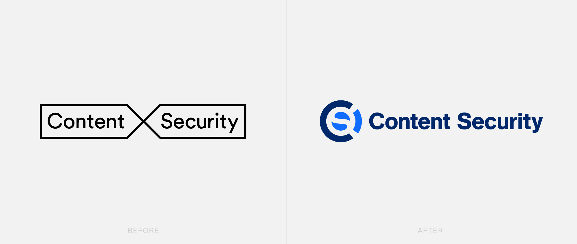
The Content Security brand needed a refresh to take it from a IT lead technical company, to a senior player and communicate a level of confidence, competence and considerateness. Having been in the Cyber Security industry for over 20 years, they also wanted to amplify the seniority and depth of experience within the company. The primary challenge was to avoid the pitfall of coming across like a start-up or fledgling tech company.
![]()
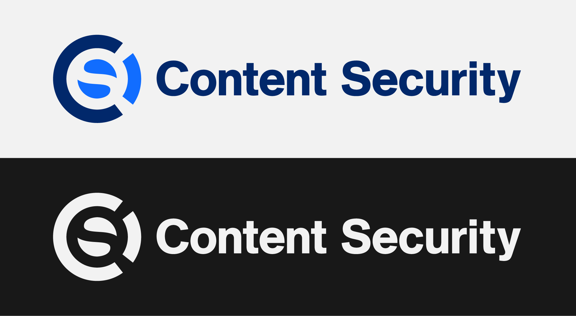
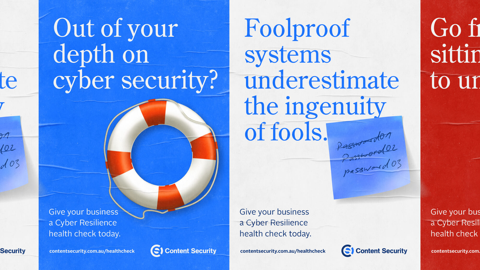
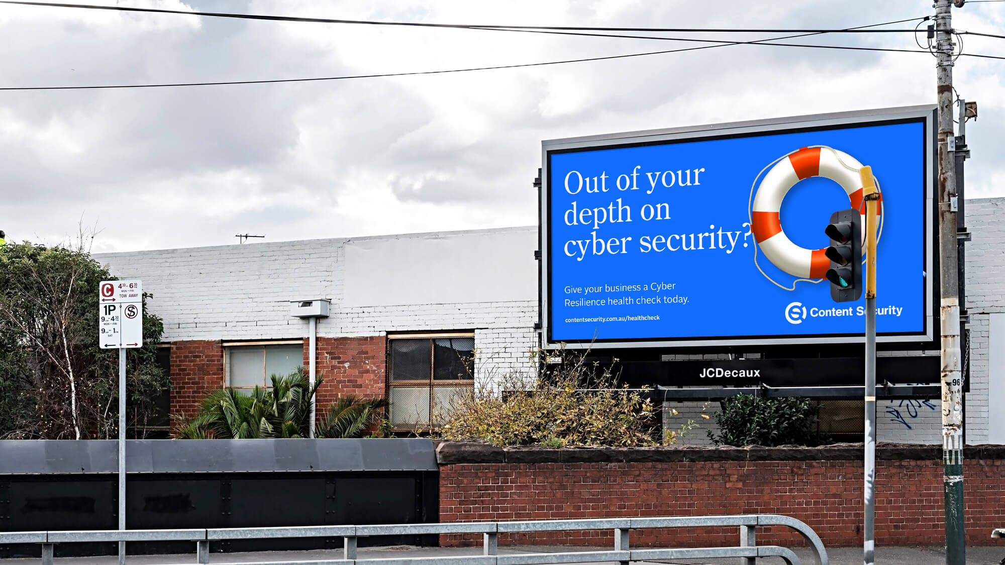
The brand symbol is derived from a combination of the monogram CS, which was a request in the brief, and the idea of a Life Bouy. The Life Bouy is an internationally recognised safety device. The metaphor of ‘staying afloat’ resonated when compared to the confusing sea of the internet and the risk of business failure (going under) in the event of a serious cyber incident.
![]()
A suite of icons based on the circular device was created for use within the organisation. This extended to being also rolled out across the website.
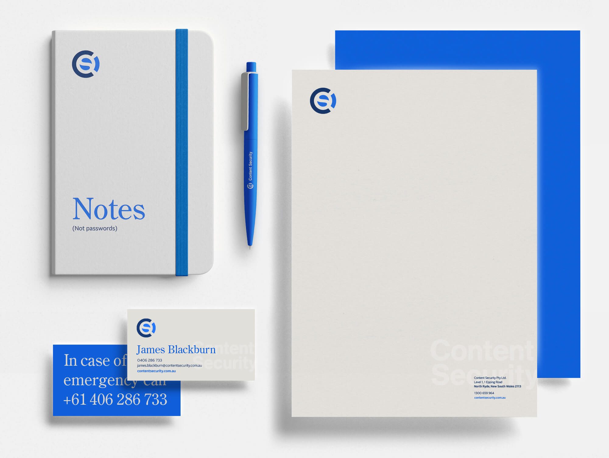
While a primarily digital organisation, a suite of stationery was created for applications and as promotional items.
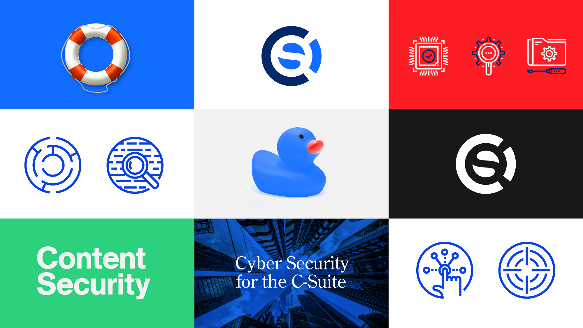
A range of brand assets was created and defined in a comprehensive brand guidelines. The guidelines are made to be flexible and grow as the organisation adopts and implements the new brand. A conscious choice to use a blend of a modern humanist typeface and a traditional serif gives tone and texture to communications. This blend of modern and traditional highlights the depth of knowledge within the company and helps communicate a balanced, sensible approach to cyber.
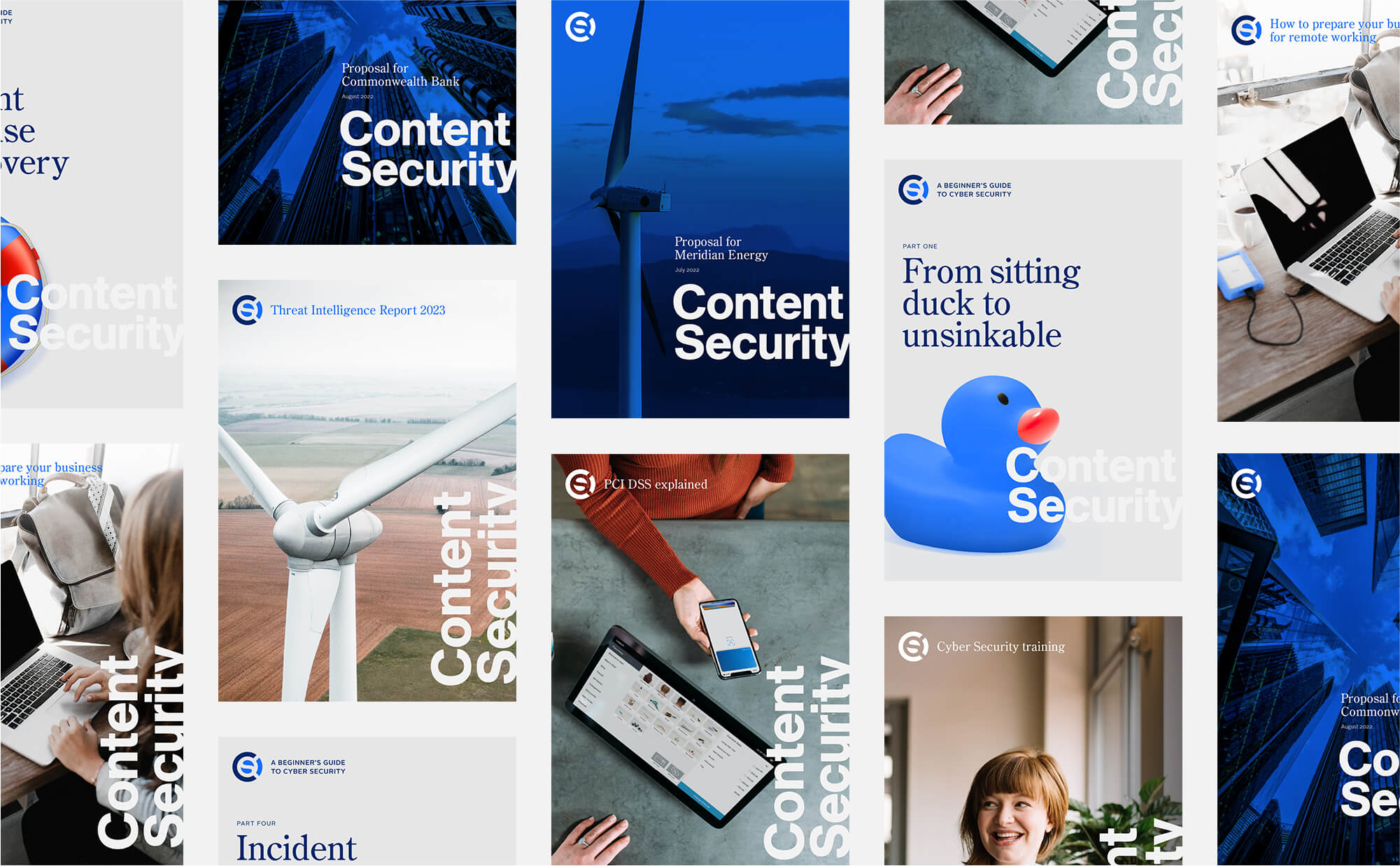
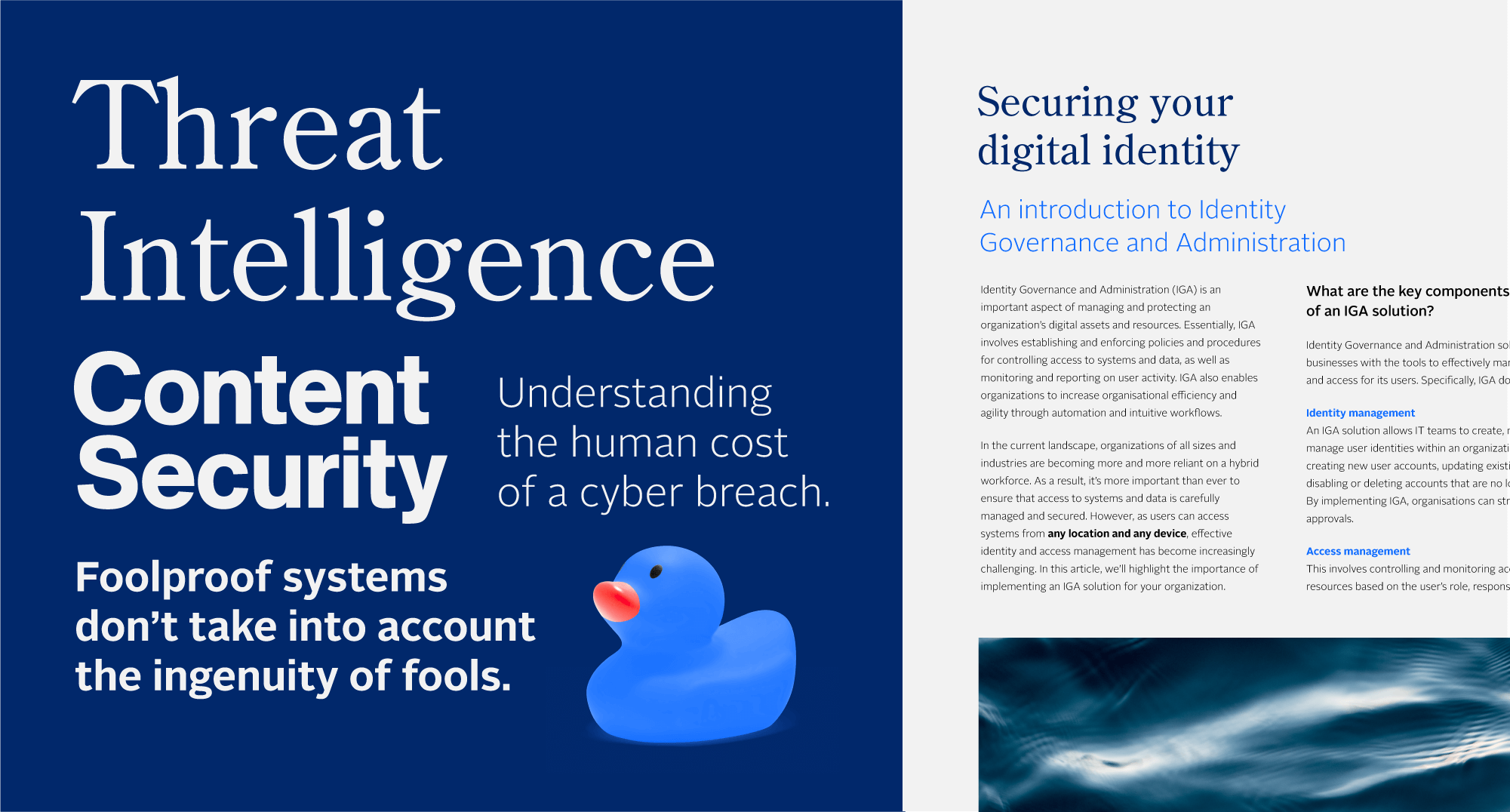
The team creates many white papers, proposals and technical brochures as part of their marketing. A simple design approach was adopted to ensure the ability to create these internally using minimal design software. It was important to them to have the ability to cost-effectively generate new content.
The brand has room to evolve and adapt to the growing business needs. Over time it will expand into new applications, software & websites. This project was one of a range of projects I’ve created for various Cyber Security companies. I’ve found I have a real curiosity for this industry and it’s helped me learn more about the complexity, dangers and importance of online security.
If you’d like to discuss a project for your Cyber Security company, please get in touch today.
Skills
Stakeholder Management, Concepting, Design