

05 Jul Hamburger Revolution
Mini screens for surfing the web seem to be here to stay – at least for the next few years. During this time I’m campaigning for a hamburger revolution.
In the last two months I have designed and built three new websites. All of which were hugely different in their design approach and business need.
I don’t adopt a mobile first approach to web design – and the reason for that is that I find it unexciting to do so. Very few mobile websites are exciting. They are functional but not exciting. And getting clients excited needs to be part of the presentation process.
I prefer to adopt a all at once approach. Sell the functionality on a desktop wireframe with support from a simpler mobile wireframe. I find that showing how desktop translates to mobile and vice-versa is a better way of explaining responsiveness and how it works.
Mobile UX
There’s so much content on the ‘net’ sharing research, data, and opinion on UX. The general rule seems to be “do what the majority of others are doing because that’s what people are habitually used to”. For example hamburger menus – do they go in the top left or top right. I often ask myself whether this form of design will lead to bland cookie-cutter websites or breed a whole new environment where creativity will thrive.
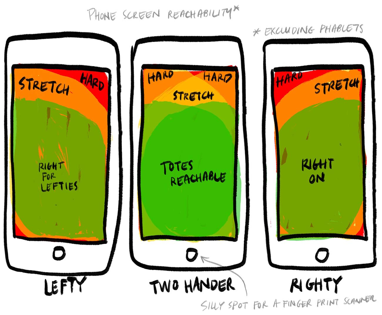
 Hamburger top left or top right?
This is a huge discussion and it rivals the online discussion between GIF and JIF. (clearly it’s GIF with a hard G). With hamburger menus I follow the logic that most people are right handed so putting it in the top right is the best choice. Many would disagree.
Lots of ecommerce sites put it in the top left. Why? They clearly have the backend data to support this. Maybe it’s because few people shop while walking? Maybe people shop while on public transport or sitting on the toilet, where they have two hand free?
Then all the other sites put it in the top right! There’s too much confusion of what should essentially be a pretty easy decision. It makes for some expensive conversations around boardroom tables.
I think we’re all wrong
If you look at the hotspots above you can see that the menu (for the best user experience) should be right in the centre. So why don’t we do that? Who is going to be brave enough to break with convention and start a hamburger revolution?
Let me know when you do so I can bravely follow along.
P.S. Even better – your phone probably knows if you’re left or right handed by the patterns used in your finger printing etc. So why can we serve up a responsive site based on that?
Sorry, the comment form is closed at this time.